Figures
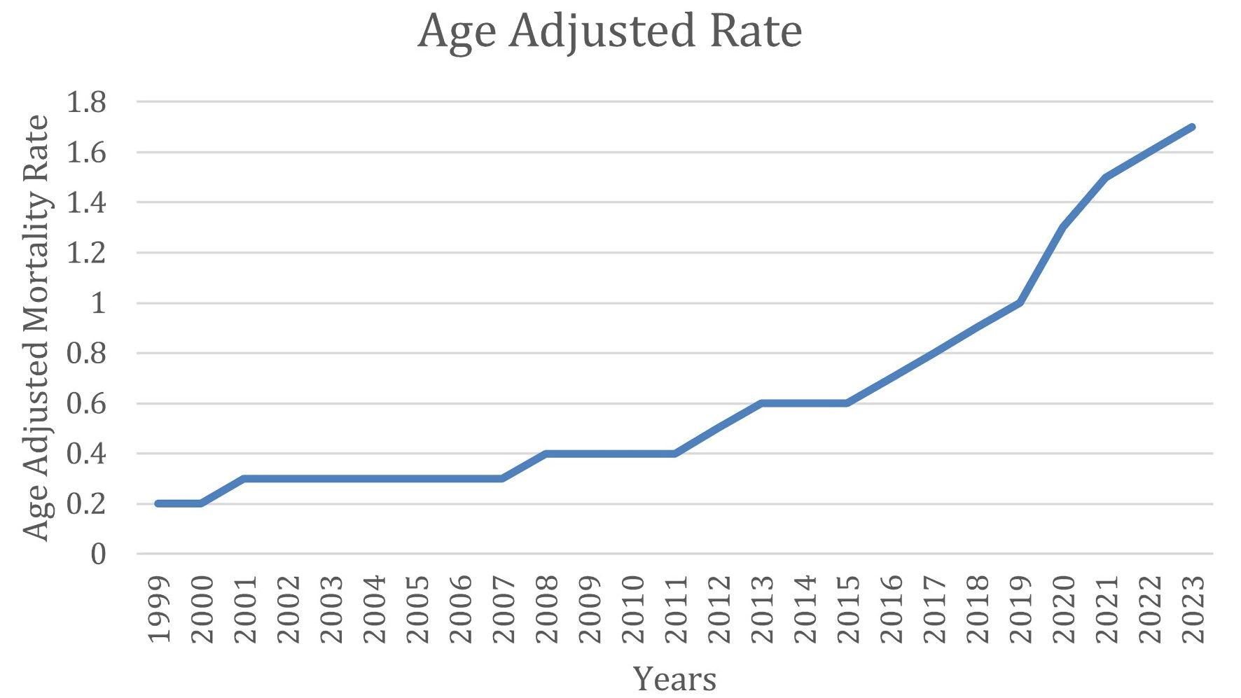
↓ Figure 1. AAMR due to AF and cirrhosis and AF over 25 years. AAMR: age-adjusted mortality rate; AF: atrial fibrillation.
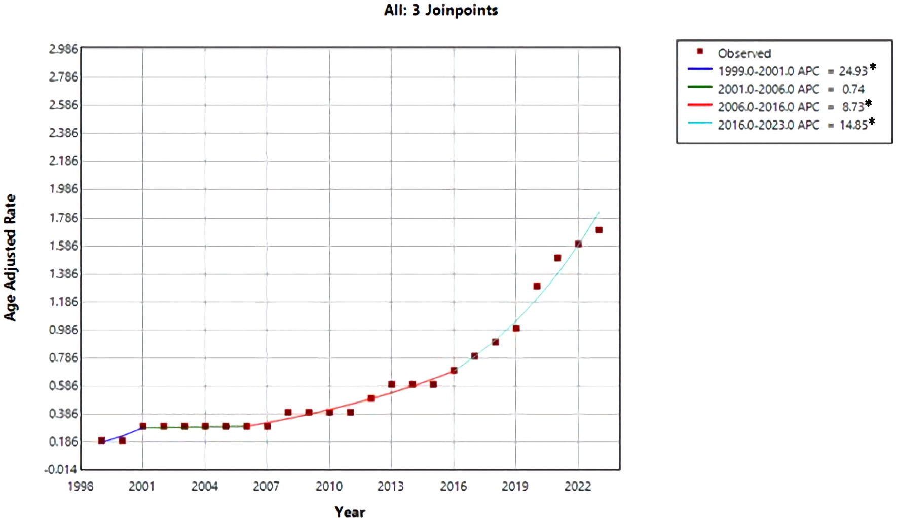
↓ Figure 2. Trend of AAMR due to AF and cirrhosis over the years. *Indicates that annual percent change (APC) is significantly different from zero at the α = 0.05 level. Final selected model: three joinpoints. AAMR: age-adjusted mortality rate; AF: atrial fibrillation.
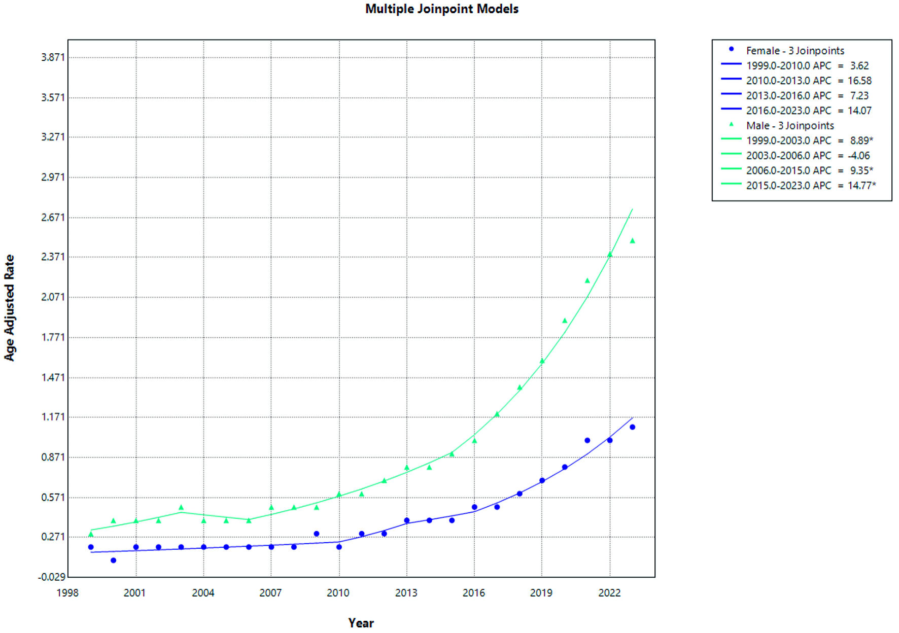
↓ Figure 3. AF and cirrhosis–related mortality stratified by gender. APC: annual percent change; AF: atrial fibrillation.
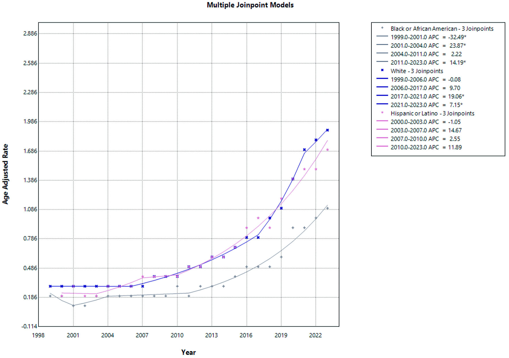
↓ Figure 4. AF and cirrhosis–related mortality stratified by race. APC: annual percent change; AF: atrial fibrillation.
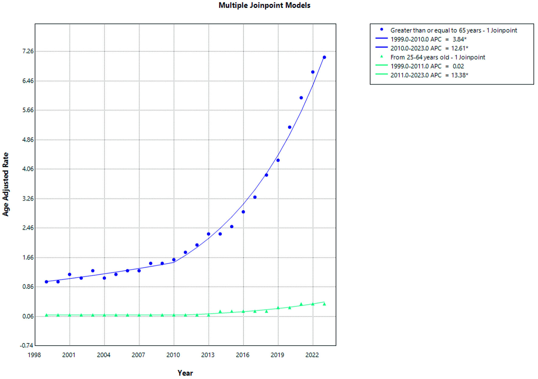
↓ Figure 5. AF and cirrhosis–related mortality stratified by age. APC: annual percent change; AF: atrial fibrillation.
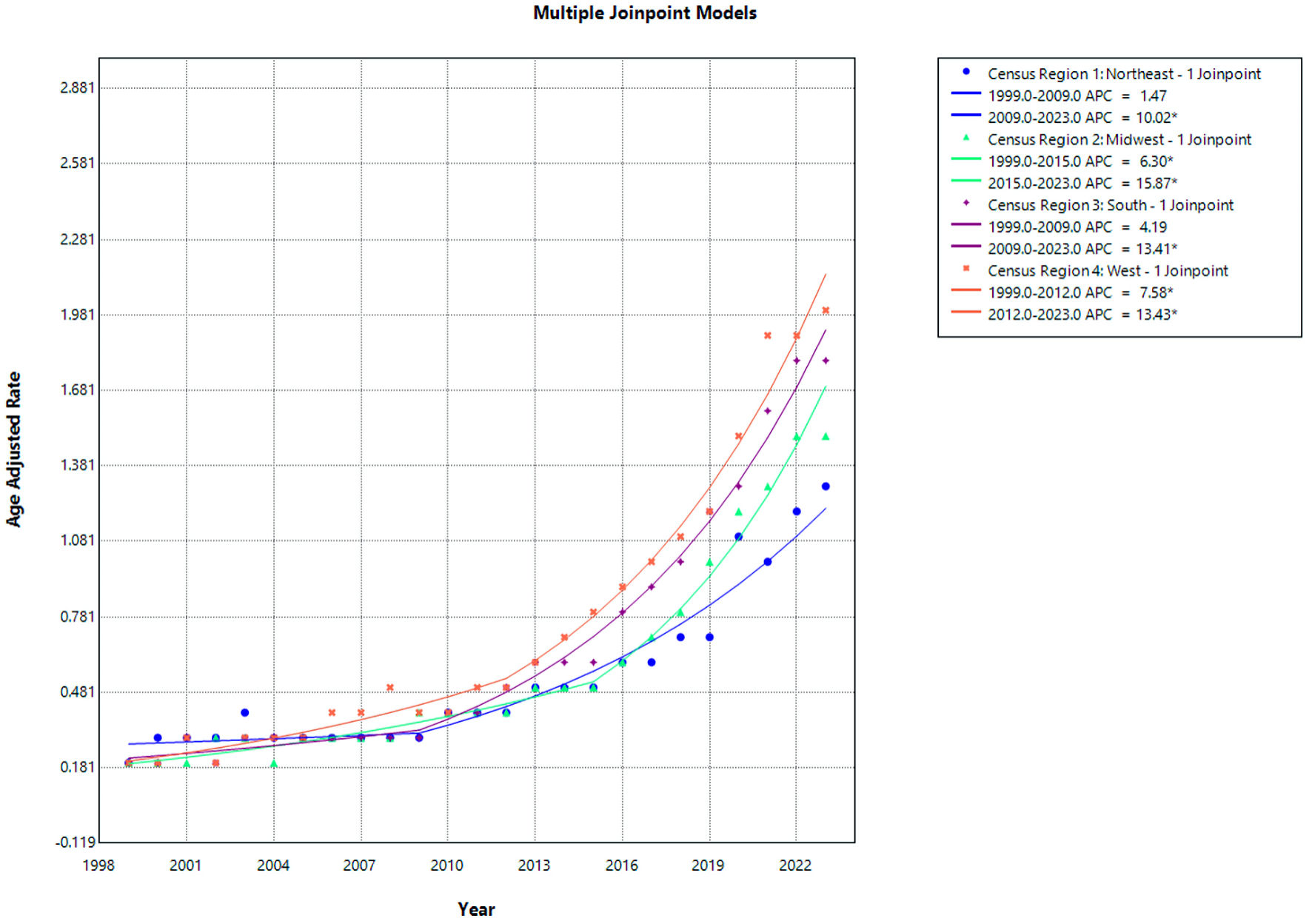
↓ Figure 6. AF and cirrhosis–related mortality stratified by census region. APC: annual percent change; AF: atrial fibrillation.
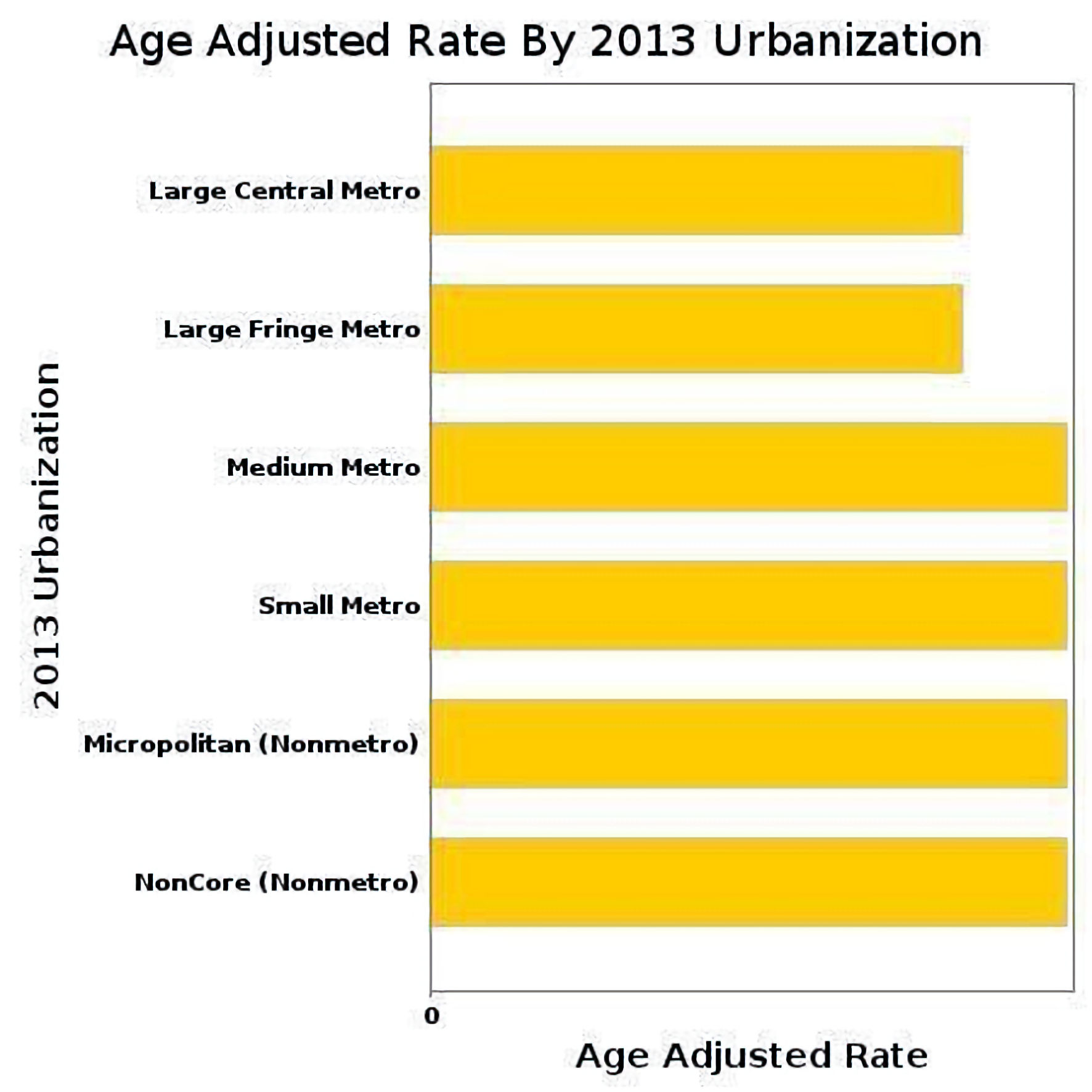
↓ Figure 7. Overall AAMR of urban–rural classification due to AF and cirrhosis. AAMR: age-adjusted mortality rate; AF: atrial fibrillation.
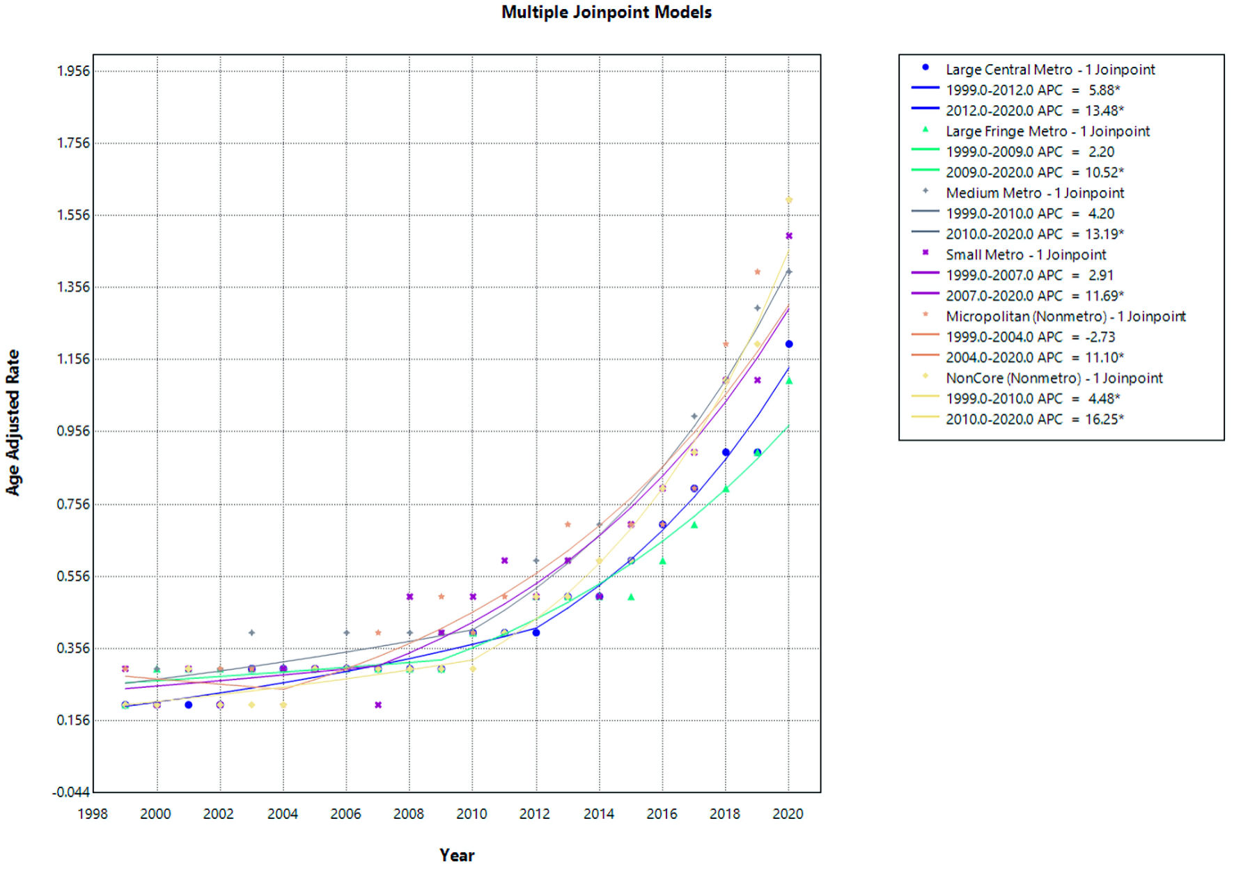
↓ Figure 8. Urban–rural trends in AF and cirrhosis related mortality. APC: annual percent change; AF: atrial fibrillation.
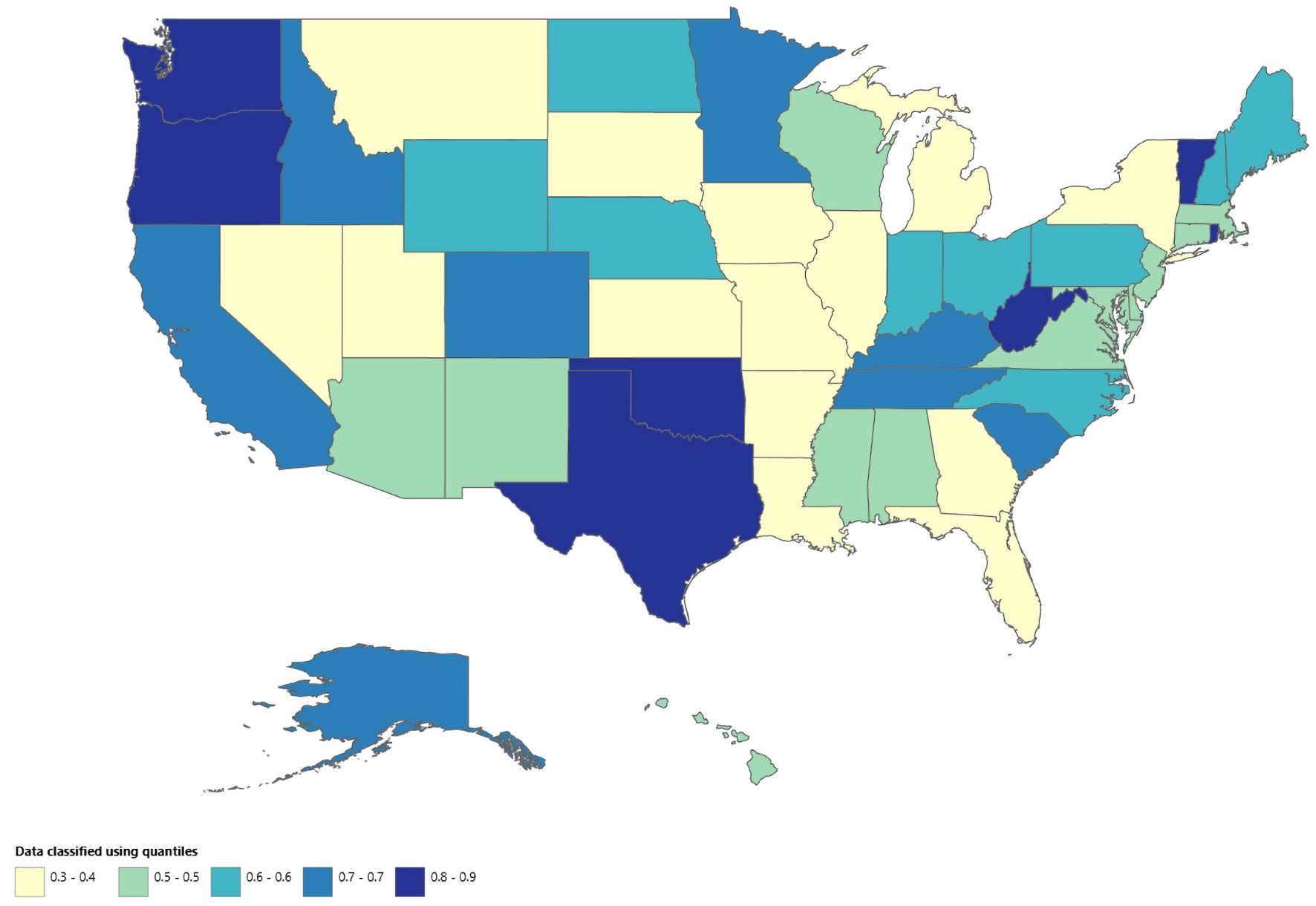
↓ Figure 9. Map showing geographic distribution of AF and cirrhosis–related mortality from 1999 to 2020. AF: atrial fibrillation.
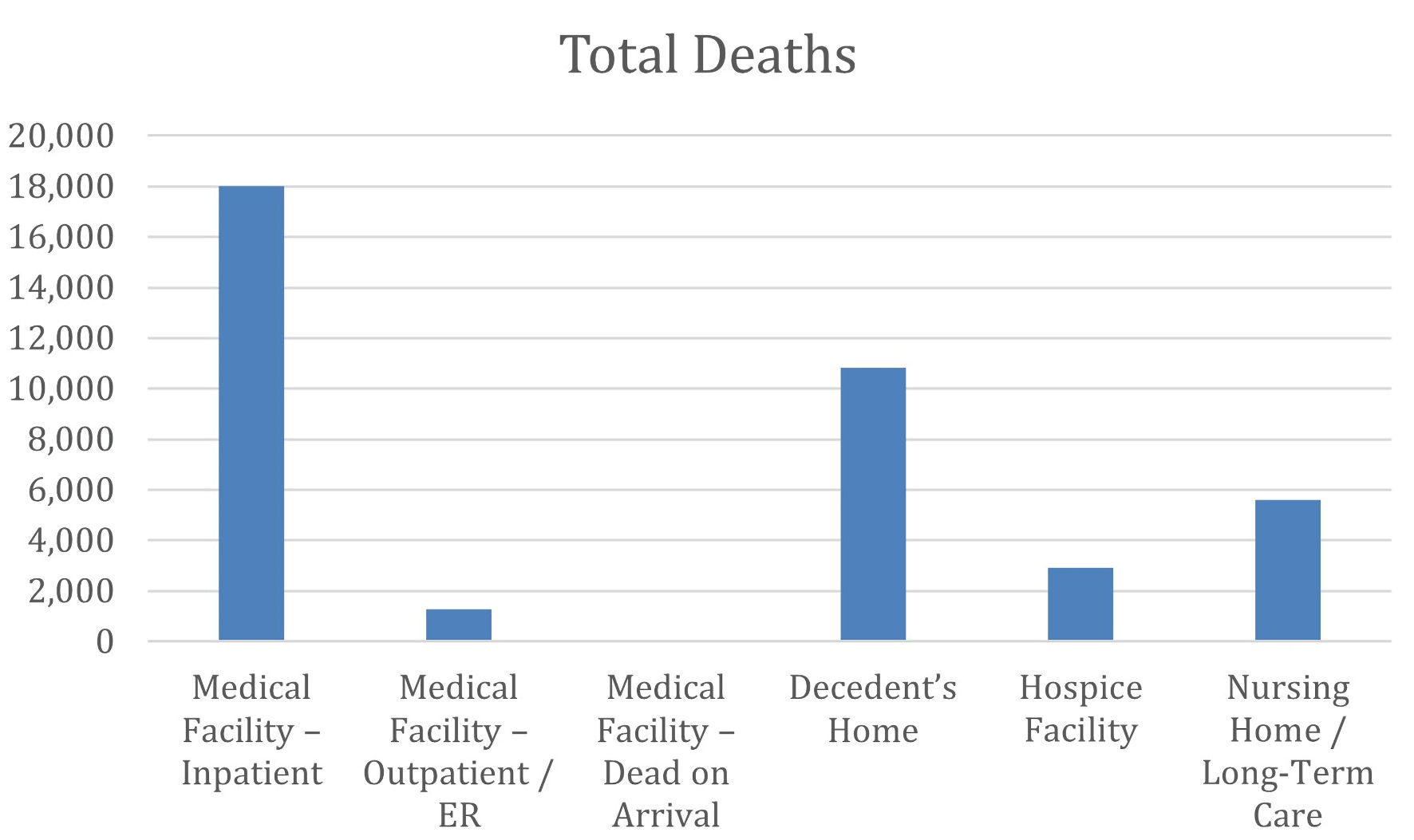
↓ Figure 10. Distribution of total deaths due to AF and cirrhosis by place of death. The bar chart displays the total number of deaths on the y-axis stratified by place of death on the x-axis. AF: atrial fibrillation.